Your venture is solid.
Now let's design a brand that bags the summit.
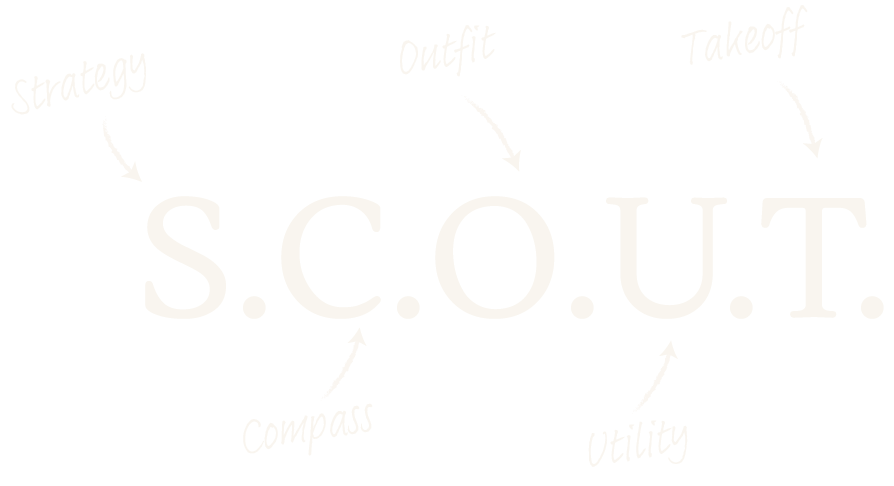
Don’t waste anymore time working with fragmented branding. I craft high-performance brand identities using my swift 5-week, 5-step S.C.O.U.T. process—so you can focus on scaling your business.
Does your brand reflect the quality of your offering?
THE CHAOS
Are your brand visuals a mess, confusing customers and hindering every marketing push?
THE MISSING ROI
Is your brand story not connecting—leading to low conversions and missed pricing power?
THE TIME TRAP
You can't afford a drawn-out, 9-month creative process to fix your brand? (Can anyone?)
BUT WHY DOES IT MATTER?
In a crowded market, customers don’t just buy your product—they buy the confidence they feel when they see your brand. A disjointed visual identity creates a subconscious trust gap that no amount of sales copy can bridge. It often costs you the sale before the conversation even begins.
Most founders think there are only 2 options for branding their venture:
Plug a prompt into AI…hope for the best…and get a soulless logo with no story, or strategy behind it OR pay 6 figures to an agency for a drawn out, inflated branding process.
But there’s actually a 3rd, much better option….
Hi, I’m Jane.
A brand strategist forged in the field—literally. I ditched the corporate game to solve the brand identity disconnect for premium outdoor founders
PRECISION
I apply the systems and strategic rigor that I learned working with Fortune 10 companies and global agencies for over 15 years
PASSION
I’m a gearhead, lifelong outdoors enthusiast, and former climbing guide. I totally get what works in the field—I use it every single day
PROMISE
I only take one client at a time, guaranteeing senior-level focus, and a quick delivery…no passing this off to a junior designer
THE 5-STEP, 5-WEEK BRAND BUILD PROCESS
The S.C.O.U.T process is a dialed-in strategic trail map I’ll guide you through to replace brand chaos with clarity and structure. Your final assets include a full brand vision + mission statement, brand guidelines, visual identity system (logo, color, type etc.), presentation deck, and launch guide. Everything you need to dominate the market.
No guessing. No agency bloat. Just direct, high-performance results.
A high-performing future for your business
INCREASED REVENUE
Your brand investment will translate into higher ROI and better pricing power
MARKET AUTHORITY
Command premium respect and position yourself as the definitive leader in your industry
FIERCE TRIBE LOYALTY
Turn customers into advocates, generating organic word-of-mouth, and strong retention
The summit awaits
You’ve done the hard work of building a business. Now, let’s build the market lead you deserve.
Your cohesive brand identity is the single biggest asset that will increase the value of every dollar you spend on marketing. Marketing without a brand is like kayaking without a paddle.
And an added bonus? My business mission is to fund my hands-on global charity work. So just by working with me, you make the world a better place.
I want to invest 20 minutes into your business, for free. This isn't a sales pitch. It’s a no-obligation strategy session focused on your unique challenges and the quickest path to market dominance. I want to help.
What people are saying
Trusted by
No strings, no icky sales tricks.
Let’s hop on a simple strategy call. Scroll down to pick a date.
